6+ Tips to Engage Users and Get More Inquiries Through Your Website
Ok so by now you know that you probably need a website for your small business. BUT—having a website isn't enough.
You need to increase user engagement and convert those visitors into valuable inquiries.
Oof.
But how?
Great question. And it's one we're going to cover today.
Let's explore effective strategies to boost your website inquiries and keep users engaged.
And by implementing these tips, you'll be well on your way to maximizing your website's potential.
(While you’re at it…if you want to make sure your current website is set up to turn those lurkers into buyers? Download my free Website Health Assessment Checklist)
Ok… let’s dive in to the tips to increasing those inquiries through your website!
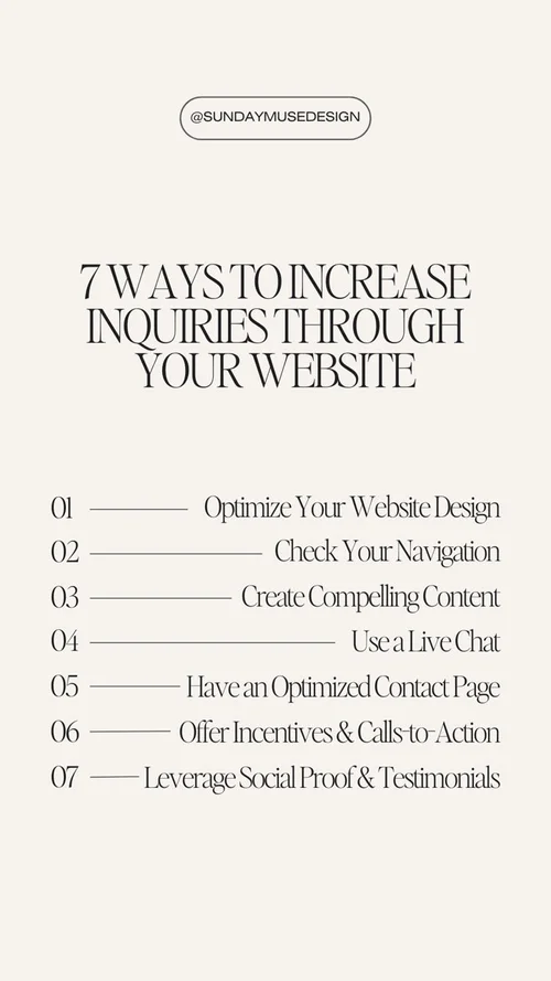
Optimize Your Website's Design and Navigation
First impressions matter, and your website's design plays a crucial role in capturing users' attention.
Steve Jobs once said, "[Design] is not just what it looks like and feels like. Design is how it works.”
And he was absolutely right.
Good design is more than being pretty. It's also about working well. Easily. Intuitively.
Some things to consider when it comes to your design:
Make sure the design is appealing to your target audience. What does your ideal client WANT to look at? A newly engaged couple looking to hire a wedding photographer is going to want to see a certain website design. A woman in her mid-to-late-30s who's shopping for new skincare isn't going to want to see a design that looks like it belongs to a lawyer.
Make sure your site is easy to navigate:
Keep only 5-6 links in your top main navigation. The rest can be hidden or go in your footer.
Incorporate crystal clear Calls-to-Actions throughout your site so it's easy for your user to know where to go next.
Get rid of clutter.
Incorporate white space.
Scrap the cheesy stock photos. If it's in your budget to hire a brand photographer, do it. Branded photos with your face work wonders. If it's not in your budget, then I highly recommend that you consider purchasing high-quality stock images. Here are a few of the best places to purchase stock images for female entrepreneurs.
>>>Here are 12 Powerful Website Design Must-Haves to Boost Your Conversions
Create Compelling and Relevant Content
Content is king (I know, I know...insert eyeroll). But content (or lack of it), can significantly impact user engagement and inquiries on your website.
Consistently creating high-quality, valuable content will help position you as an authority in your field. Which also helps people trust you.
3 things to keep in mind when it comes to creating content:
Craft informative, valuable, and engaging content that resonates with your target audience.
Use relevant keywords strategically throughout your content to improve search engine visibility and attract organic traffic.
Incorporate visual elements such as images, videos, and infographics to make your content more visually appealing and shareable.
And once you have your content… you need to update it.
Implement Live Chat or Chatbot Features
Offering real-time assistance through live chat or chatbot features can greatly enhance user engagement and increase inquiries. These features allow users to ask questions, seek guidance, and receive immediate responses. By providing prompt and personalized assistance, you can build trust and encourage users to take the next step towards making an inquiry or purchase.
Some chatbot and live chat plugins to check out:
Optimize Your Contact Page
Let's talk about your Contact Page.
This page is critical...especially if you are a 1:1 business and/or small business. If making a connection to others is important in your business model, then you need to put a link to your Contact Page in your top main navigation. Bigger brands like Target and Sezane can get away with having their contact linked in their footer.
And—pro tip—Make sure your Contact link in your navigation is the last one, closest to the right. There's some sales psychology at work here.
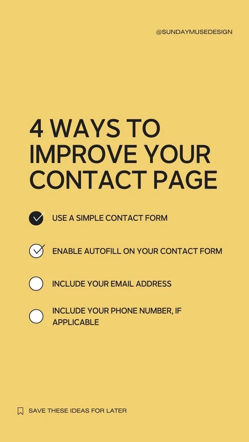
Things to have on your Contact Page:
A simple contact form. Remove any unnecessary fields in the contact form to reduce friction, making it easier for users to submit their inquiries.
Enable autofill on your contact forms to streamline the inquiry process. You want it EASY for people to get in touch with you.
Include your email address and/or phone number. PLEASE. Sometimes someone wants to simply get in touch with you. Not listing your email address (at the very least) makes you look unprofessional and unapproachable.
Offer Incentives and Calls-to-Action
Motivate users to take action by offering incentives and clear calls-to-action (CTAs).
For example, you can provide exclusive discounts, free trials, or downloadable resources in exchange for users' contact information. Here's how to grow your email list (aka collect your user's information) with a lead magnet.
Place these CTAs strategically throughout your website, such as on landing pages, blog posts, and product/service pages, to encourage users to make inquiries.
Pro Tips:
When it comes to your CTAs, use buttons. Don't make someone scroll without giving the option of clicking on a button.
Except for your home page, have one CTA destination per page. For example, more than likely, all buttons on your "Services" or "Work with Me" page will take your user to your Contact Page. More than likely, all buttons on your "About" page will take your user to your "Services" or "Work with Me" page. Your home page is the one page you can have multiple destinations. Here's how to effectively write and structure your home page...with examples!
Leverage Social Proof and Testimonials
72% of consumers say positive reviews and testimonials increase their trust in a business, 92% of customers read online reviews before buying, and 88% of consumers say reviews influence their online purchasing decisions. (Source)
Those testimonials? That's called social proof.
Social proof is a powerful tool that can boost user engagement and inquiries. Display positive testimonials, reviews, and case studies from satisfied customers on your website. This helps build trust and credibility, making users more likely to inquire about your products or services.
And I hate to break it to you, but that page you have dedicated to "Praise"? Probably not getting too much traction. Studies show that a much more effective way to show off your testimonials, results, and social proof is to sprinkle it in throughout your website.
But yes—sprinkle it alllllll over your website.
And another hate-to-break-it-to-ya moment: No one's reading walls of testimonial text. Pluck out the most powerful sentence or phrase from each testimonial and display THAT. Not the entire novel.
Bottom line: increasing inquiries through your website requires a combination of thoughtful design, engaging content, user-friendly features, and effective calls-to-action.
By optimizing your website's design and navigation, creating compelling content, implementing live chat or chatbot features, optimizing contact forms, offering incentives and CTAs, and leveraging social proof, you can significantly boost user engagement and drive more inquiries.
And remember to download my Website Health Assessment to make sure your own website is set up to be a revenue-generating machine.


